First Hand Artist:
JOE KEYS


We had the pleasure of meeting an artist called Joe Keys. He is a young artist based in Durham in the UK. He is in his last year of a Fine Art degree and specializes in the medium of collage.
This is a very fortunate as here in Oman we are never able to get people to come across to show their work like in the Europe.His work is very different to works that I have seen related to Collage.I always thought when you do collage you had to make the collage look 'full'. Meaning you had to use all the space up to create the collage. But Joe has shown me a different perspective of collage;
his work mainly is very 'clear' and he does not use all the space.
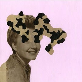
Before meeting Joe we already experimented on collage ad made 1 art piece as an exercise. To the right is what I created in the first class of collage. I had no idea of what I wanted to create so I just did what I felt like therefore is piece is very random.

The materials used consists of:
- old newspaper
- gold foil
-gold ruffled paper
- string
-wood
-plastic paper
-paint
COLLAGE
He showed us his favourite art pieces that he has created over the years. His work consist of people with black and white shapes coming out of their head and eyes.Joe mention that by doing this it makes people have their own interpretation of what the art piece could mean. I really like it because it is so simple yet meaningful. He uses old materials like newspaper to find his figures of people and then his uses old record sleeve to create the black and white swirls on top of the heads, and his background is plain or painted. Joe goes to Junk shops and thrift shops to collect his materials.
I realized that a lot of collage art are generally made out of old warn out newspapers, fabric, vintage materials or anything that has a quality of oldness in it. Which relates to what we had to do over the summer; we had to collect old materials for our collage that we would be making when we return. For me I got sent a box of old fabrics and papers from my grandma's sister. I am also hoping to use those materials to create my final piece.


But where does Joe get his inspiration from?
He gave us a list of artist that inspire him and here are some of them, some of them he has been to their exhibition:
1) Thomas Baryle
- Gateshead, Baltic
-November 2013
"All in One"
2) Hajra Waheed
- Gateshead, Baltic
" The Cyphers"
3) Tintin Cooper
- Scambled portraits 2009
4) Nicholas Ballesteros
"Unconventional absurdity"
5) Lubaina Himid
-Liverpool
"We Will Be Black Woman Time Now"
6) Lesley Hilling
- York, May 2017
"Aesthetica Prize"
7) Lola Dupre
-Glasgow, Scotland
"Reinvention of the Soul II"


I know a lot of artist get inspired but me personally I don't feel I can get inspired by other artist easily yet. I find it hard to get inspired by artist online.Every artist just is so different they have their own theme, message that they want to get through so it feels as if it is impossible to choose an artist that you can focus on. But Joe style is very different and his ideas really is simple to look at yet very thoughtful. I like his style as it has shown me a different way to interpret 'Collage'.
Some things that Joe mention while he was presenting were that:
- Art involves in a lot of experiments which I completely understand and agree with; as an'art-maker' you really do have to experiment what is the best way to portray your art and does it look good enough? I think experiments allow us as an individual to look at each art piece at different ways before making your final one.
-Joe personally likes to experiment with different shapes and texture with different record sleeves that he gets and old materials.
- His art work are open for interpretation- like with his art work they are very much similar in the sense of how it looks. Up on top are some of his work that he has created. He mentioned that you can think of what ever the art piece could mean because its open for suggestions.
-Lastly the fact that he does commissions he mentioned that even if the customers like his work what they are for may not please them so it is a very work to do.


I wanted to go with the theme golden and white as it was my first time with collage. I had no picture of how I wanted it to look like I just started with the wood which is the base then I started to pic up different materials to put on. As you can see up on the right side there are splatter of red and yellow paints; at first I didn't have the paint on but I looked at my work and it looked really plain so I thought by putting splatter of paint on would make it look more 'collage like'
With the second piece we did this when Joe was with us.After his presentation we were given a task to do. We had to work on a black hexagon piece and in the end it would have to join up with our peers in the class and they have to be able to relate to each other and it would create one big art piece. I had no idea what I want to create my my friend who did the House collage above the foot one inspired me as she got her picture from a small booklet. I then had a look and found the foot image I just fell in love with it. I love how was drawn out and so I cut out and placed in on the black hexagon. I then had a look in the newspaper and found an image of a flying elephant and this woman which I also liked. With this piece I knew I wanted it to be plain and simple like Joe's style so I stuck with those pictures. I had a fiddle around with how and where I wanted those pictures to go. In the end I ended up having to put the elephant and the woman's head in between the gap of the foot. It did look plain so I thought of a way I could make it look brighter so I decided to paint it diagonally red. But the red is dabbed onto the hexagon not painted so it gives another texture to the piece.
I decided to join up my piece with the House image because it really fits into each other. There is a similarity the colours match up each other which I realized after looking at the image. It's also both mainly black and white and I love how the foot is coming off the hexagon so I had to join with the house one.
"OBSESSION"
Obsession is the concept of creating our final piece of collage. 2 artist that I will be referring in my final piece are Hannah Höch and Sir Peter Blake


This was something small I help my brother create and did not realized it was collage until later. While we were on the sailing trip in England I went to a couple of shops to look at the art and while we were on the last days we decided to do something artsy and went to this shop where we can make our own art. I helped my brother to create this box
The Drang Gallery
In Salcombe
In this Gallery there are lots of feminine art work. I really like the artwork as it really stood out in the shop and thought these work are so beautiful


A small slide show of 2 art gallery I saw over the summer
Sir Peter Blake

The Artist:
Sir Peter Thomas Blake born in Dartford, 25 June 1932, Kent is an English pop artist, he is best known for co-creating the sleeve design for the Beatles' album Sgt. Pepper's Lonely Hearts Club Band.His paintings are his interest in images from popular culture which have infused his collages. In 2002 he was knighted at Buckingham Palace for his services to art. Thomas Blake has made collage, sculpture, engraving and printmaking, as well as commercial art in the form of graphics.

Response:
Introduction- This is a piece of art made by Peter Blake, this piece is one of the less well known pieces made I feel. This piece uses a lot of the space up and fills the whole page up.
Visual- Is this real life? I would be so happy to see it for myself. The place full of comic books characters! It is very crowded, lots of superheroes and characters from different movies all going out in the evening.This image is full of colours from black-red. It is very vibrant and crowded.
Emotional- This image makes me feel as if I am in fantasy world yet its just too busy. The building in the back looks really old and doesn't fit in the scene of crowdedness. The building should be colourful but then it would interfere with the bright characters. It also makes me think of the olden days because of the building.
Personal Experience- This image reminds me of myself and my family walking in London.Always surrounded by big building and full of people even though it is not comic characters.
.
London- Piccadilly Circus- The Convention of Comic Book Characters, 2013
London- Piccadilly Circus [Digital image]. (n.d.). Retrieved September 2, 2017, from https://d32dm0rphc51dk.cloudfront.net/fNePbEfZWr6XhPdaPLXnMw/large.jpg
Subject Matter- The Focal point for me is probably the supernaturals flying in the sky. What makes it stand out is bright colours that are all over the piece.
Mood/Atmosphere/ Environment:
Busy - it is o crowded and there is hardly any space left foe anything else.
Crowded- It is just too crowded so if you look to the back every character is unclear.
Warm- By looking at the sky it is very bluey orangy tone which is a very sunset tone, so its a warm atmosphere that they are in also there is just so many people so it will create warmth.
Cartoon- The majority of this art piece is full of superheros and characters so it gives it a feel of fantasy.
Colour:
The colour in this piece is mainly bright colours as well as black and white


Here are more of his well known pieces.
Hannah Höch

Hannah Höch is a German artist born in November 1, 1889 – May 31, 1978.She is a collage artist, Höch's work in the concept of the “New Woman', other key themes in Höch's works were androgyny, political discourse, and shifting gender roles, she is best known for her photomontages. She collects the images and text from popular forms of media, such as newspapers and magazines, and combined them in often uncanny ways, which were able to express her stances on the important social issues of her time.

Untitled, From an Ethnographic Museum (1930)
Response:
Introduction- This is an untitled collage piece created and put in a Museum in 1930. A very unique piece that I find very interesting and 'collagey'. It stands out a lot as there is a bold red background and only 1 image which is in the middle, Hoch suggests that society looks at women much as they look at a piece of unknown sculpture: as exotic and erotic objects.
Visual- I see a very bright and simple piece of art in from of me. Simple and bold is what this piece is.
Emotional- If I was a kid then I would laugh at this piece as you can see her boobs. But as a teenager I would see it as an interesting form of art. As Hoch suggested that women are looked at like an unknown piece of sculpture ; exotic and erotic objects From what I understand it feels like a lot of people look at women like a sex object which is not true as we are more than that.
Personal Experience- I don't recall seeing any art like this, I may have see more exotic/erotic one but not one that are collage and there is different part that connect to each other.
Mood/Atmosphere/Environment
Simple- Nothing too crowded like Blake's work
Bold - The colour red really makes it stand out
Focal point- I feel the lady is the focal point of this picture.
Interesting - It's interesting how the lady is the main focus of this point, simple and straight forward.
Edgy- I like how the lady's body is made up of different component.
Subject Matter:
The red background and the women in the middle stand out a lot, the blue semi circle supports it as well. The lady's ace is very much unhappy I would say as the way shes leaning on her arm and her facial expression shows that shes unhappy.
Colour- Blue Red and black and white sculpture with a tinge of yellow on the body of the woman.
Value- I learnt from this art piece as well as Joe Keys visit that creating something doesn't have to take up all the space. Hannah and Joe's work has a similarity of using a little of their space on their pieces. This style is completely different to Blake's and I wanted to compare why I like both style. This piece of Hannah's work is very simple yet I still question myself Why shes chose to only focus on female not male.The statement that she made ,that society looks at women much as they look at a piece of unknown sculpture: as exotic and erotic objects. I understand and agree with the statement and with this piece it is very meaningful.Her piece seems more clearer to me than Blake's Piece.
With what I have learnt I will use her style of boldness on my art.But also cooperate Blake's side in on leaving my piece for interpretation and making the effect of crowdedness.
Here are some more of her famous pieces.


Process
As for my Obsession art Piece I decided to focus on those 2 artist due to the fact that it will relate to my piece. I will be using the concept of crowdedness on my piece from Blake's side and the bold colour background from Hannah's side. I had a difficulty of deciding what my obsession would be but I have come to a conclusion that I want it to be about Boys & Girls.I want to focus on boys&girls as an obsession because I feel these days the majority of teenager's or boys/girls think about girls/boys a lot of the time depending on what gender they are. They are so distracted by social media and or boys/girls that they don't have as much time to focus on school...
After coming back from summer all I am hearing constantly is : '"Did you get with anyone over the ?" "How is you boyfriend/Girlfriend?" ... All these are related to boys and girls. Typically ever since I was young its become a major topic us teenagers talk about but I have never realized it until now. So I want to create a piece of art to show a different side (my interpretation) to what goes into a girls and a boys mind.


Above is what I have been experimenting on.The image on the top right and left are of a boy and a girl and basically it is an outline of then but instead of colouring them I will be sticking images of girls (on the boy) and boys (on the girl).
Below that is a picture of my ruff sketches of how I could lay out the art piece. I really like the 1st one as well as the 4th one. With the 1st one I like the way they look up but I think to make it bold and strong there needs to be a word or phrase written above their head. But with the 4th one I like it because they are connected, half boy/girl in the shape of heart is very strong and bold and it gives a clear idea of what the piece could be about.
For my final piece I would like to us images of people from newspapers, books old materials to collage on the piece. But as for the background I want to use a bold paint to paint on or either a piece of material to put behind the boy an girl so it could stand out more.
As you can see on the hair for both people they are made out of black and white paper which I really like because it shows similarities in them and I like the idea of having it the same so it looks more interconnected.
Peter Blake [Digital image]. (n.d.). Retrieved from http://www.theartstory.org/images20/photo/photo_blake_peter_5.jpg
Composition- As you can see the building is behind everything and all the characters and superheroes are on top and overlapping each other
Value-I see now that every artist is just special in their own way. Even Blake is able to put a bunch of characters together to create a very intense piece of art. I have looked through a few of his other well known pieces but have not chosen to do it as I don't feel anything looking at his other pieces. This piece really catches my eye and makes it looks very vibrant which I really like in this piece. But it is still unsure to me why he made this piece, because all his art pieces are very difficult for me to know what is going on. His art work are not my favourite at all but I seem to like this piece rather than all the other ones. Also it does not relate to me in anyway but I want my piece that I create to be as open minded and open for interpretation to the audience.
I will apply the style of Blake's work into my piece yet I still want to find a different style from another artist to also help with the piece.
Self-Portrait with Badges
Painting
1961
The First Real Target
Painting
1961
On the balcony
Painting
Dimensions: 397′ 0″ x 299′ 0″
Location: Tate Gallery, Britain
1955–1957
Hannah Hoch Portrait [Digital image]. (n.d.). Retrieved September 3, 2017, from http://www.theartstory.org/images20/new_design/bio/bio_hoch_hannah.jpg
Composition- Everything is upfront nothing is behind and it is pretty clear of where things are.
Cut with the Kitchen Knife Dada Through the Last Weimar Beer Belly Cultural .
Flight
1931
Unknown,
But I also like this piece that was created by Hannah
Dunne, C. (2014, January 16). The Best Of Hannah Hoch, Art's First Punk. Retrieved September 02, 2017, from https://www.fastcodesign.com/3024729/the-best-of-hannah-hoch-arts-first-punk
I actually really like my draft and how my experimentation piece turn out better than I expected
After taking an Image I realized that the neck doesn't look right So I will fix it for my final piece.
I like my bold red background which is glued on not painted. I had to make a decision on whether to paint it or stick paper on for the background. I decided to glue as it will make a bolder look because if I painted it it will leave brush marks which may not make my piece look the way I wanted it too.
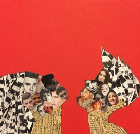
Girls & boys
This is just a bold font I put on digitally to experiment weather I like it or not. I actually really like it as I wanted it to be the title of this piece.

Final Piece
GIRLS & BOYS
Girls and Boys is a final piece for the concept Obsession. I have created this piece because I feel that it is an obsession. It may not be the best obsession or the obsession that makes sense. But to me personally I felt the need to do it. In this piece I have shown and demonstrated what I have learnt from Hannah Hoch and Peter Blake. It doesn't have to take up all the space to make an art piece. I also included both of my artist style in my art; Hannah style was the bold background which I did as well in Bold red. This then ensure my art will stand out and from Blake's I made sure I make my male and female in the image look crowded. By doing that I put images of guys in the girls side (left) and vise versa for the boy side.
Since this piece is very personal and my interpretation of obsession it doesn't actually mean that its true. Of course our head is filled with different thought and not everything will be about boys or girls. But it is what I interpreted to do in this piece. But I did not want to create a different scenario to this piece as it can turn out to be scary which will have been something completely different.
What I want to get across from this piece is that obsession can be very different and personal depending on who you are. To me this piece is personal that even some of my audience may not understand it. To me I feel constantly pushed as I don't have an 'obsession' with boys as much as I should. Which makes me question myself am why am I not 'obsessed' with boy as much as other kids are? And do I have to be obsessed with boys to fit in?
I would say I not obsessed but I do like boys but it is not what I think about all the time. I have other things such as: school, life, family, friends and many more to think about. And Simply boys is a little part of my life.

Slides

